A24 Rebranding
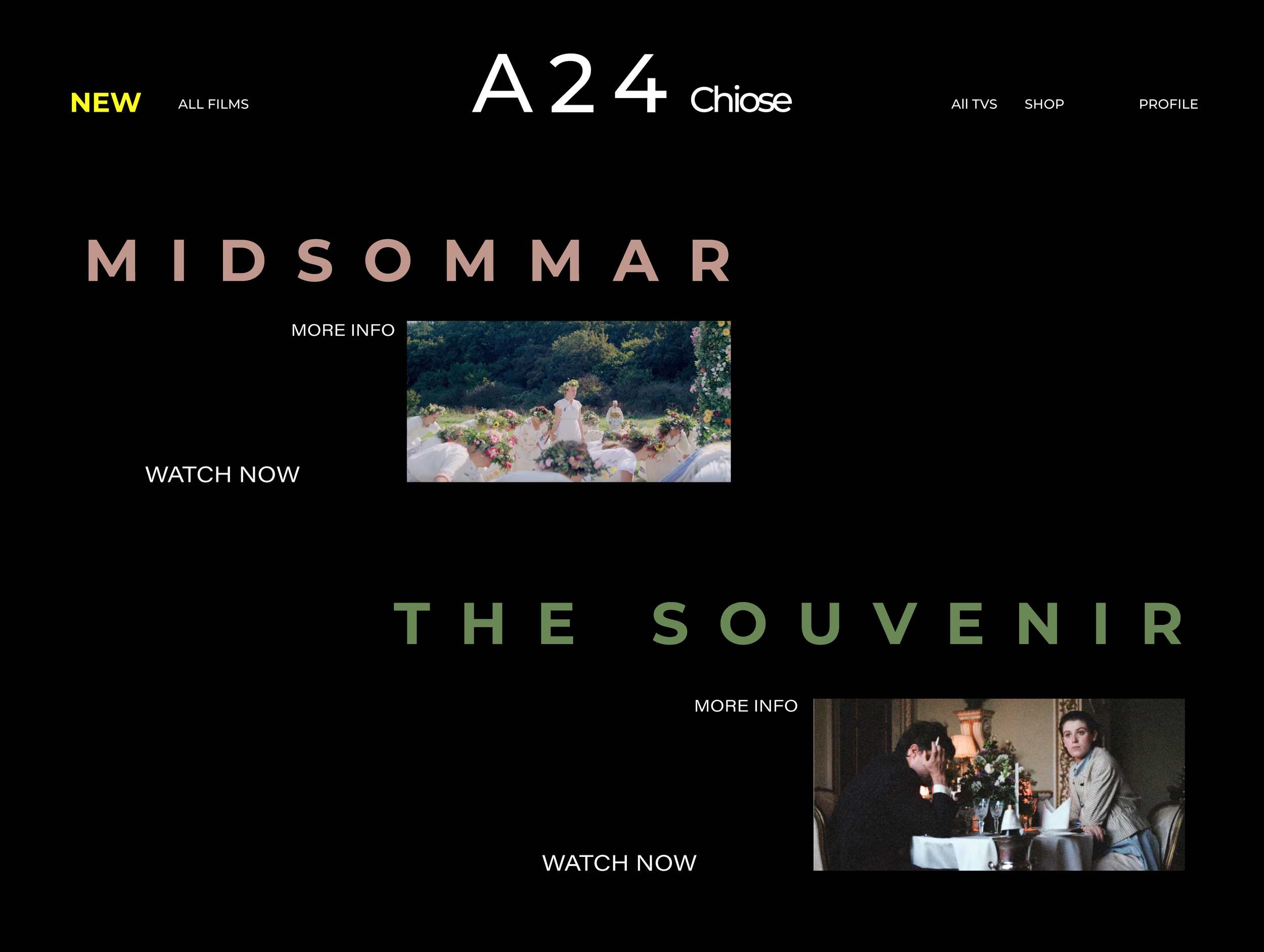
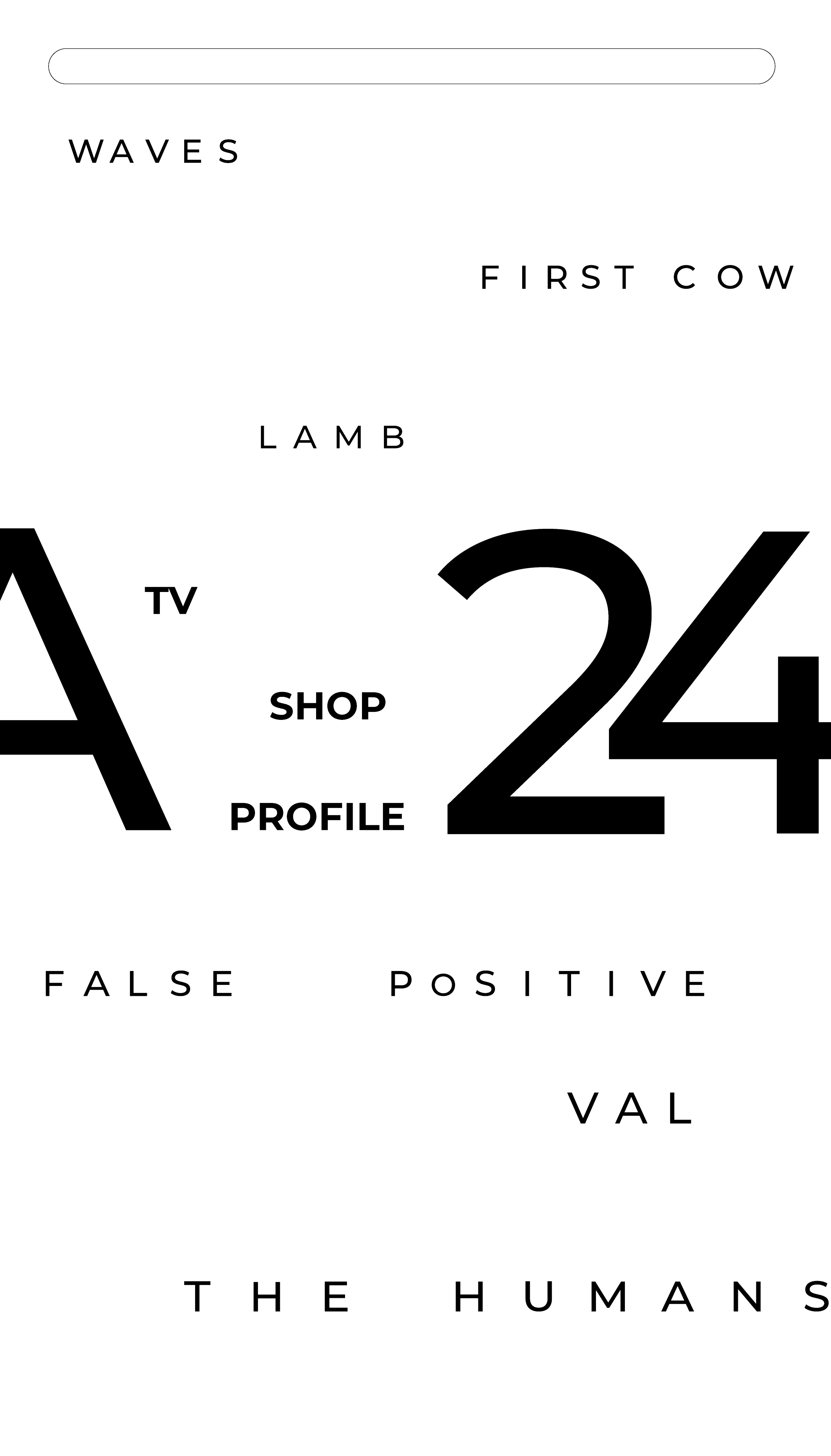
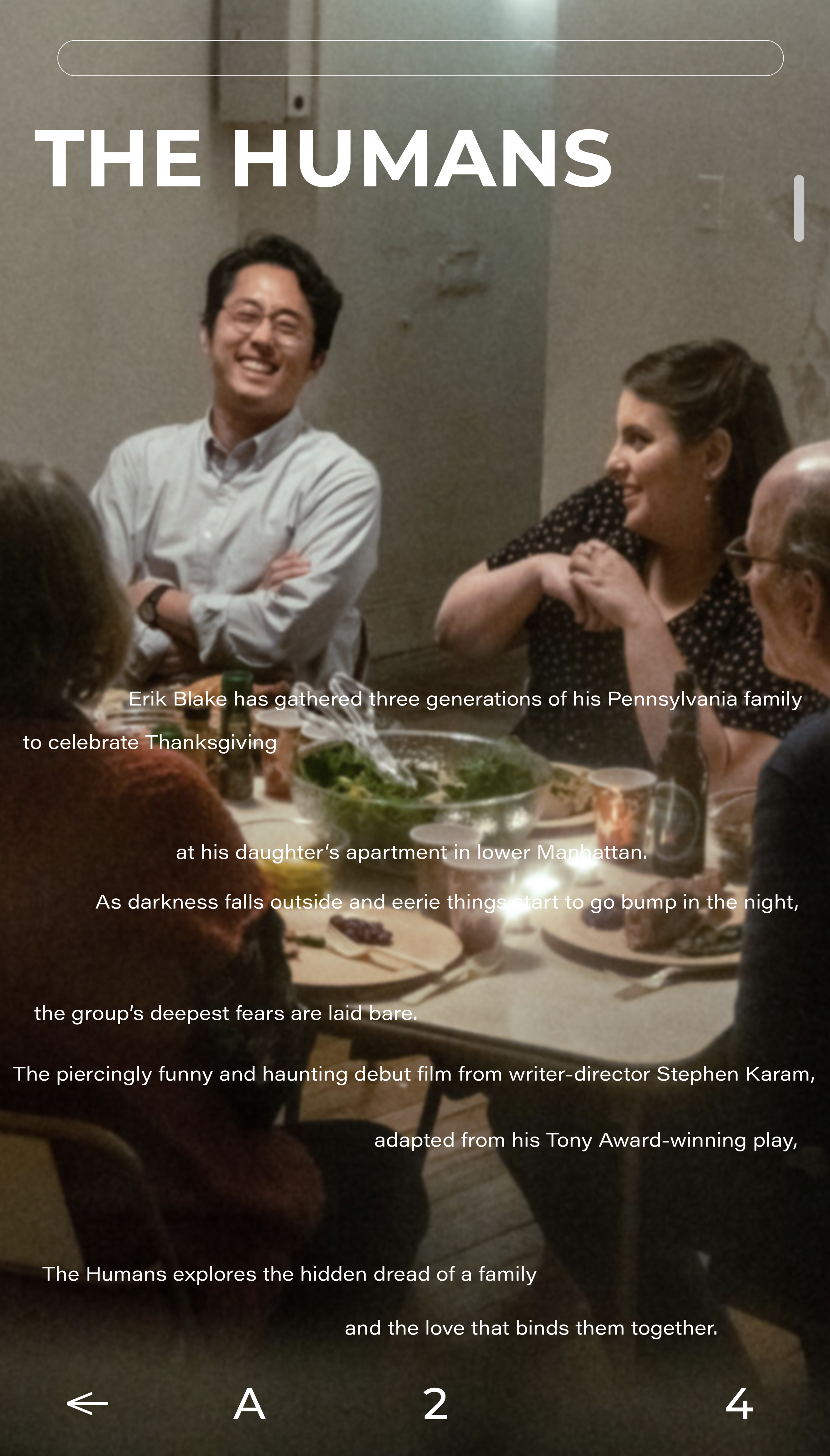
This academic project explores how A24’s identity could become more participatory while preserving its distinctive, independent character. Rather than creating a single fixed logo, I developed a flexible typographic system inspired by volume sliders and equalizers. The spaces between words expand and contract to represent choice, intensity, and different ways of experiencing a film.
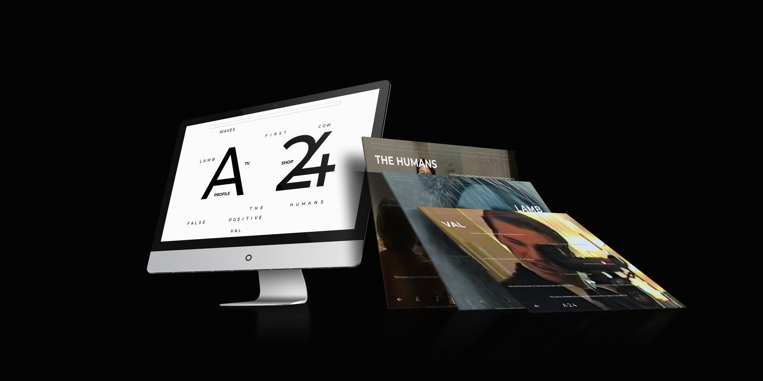
My core output was a repeatable brand behavior connecting concept, typography, and application. The system can adapt across different films and promotional touchpoints while maintaining a consistent visual language—giving each story room to shift without losing the broader A24 identity.
Conceptual Rebrand · Brand Strategy · Visual Identity · Digital Experience
Role: Brand Strategy & Visual Identity
Core Output: Flexible Typographic Identity and Application Principles
Academic Brand Exploration · Not affiliated with A24